
REI Ready
Case Study
Project Type
Date
Location
Group Project
May 2024
San Francisco
REI Ready is a collaborative concept project I worked on in May 2024. Our goal was to design a companion app that enhances REI’s in-person outdoor classes and adventures, giving users a seamless digital tool to prepare, track, and reflect on their experiences.
This app would not only support REI’s mission of making the outdoors more accessible but also strengthen their position as the #1 outdoor retailer in the market.
🥾 Who Are Our Trailblazers?
Uncovering the Hidden Habits of Hikers 🌲
To build something meaningful, we first had to understand our users — the outdoor lovers who lace up their boots regularly and head out into nature.
🧭 Who We Talked To:
We defined our core users as regular hikers, meaning they hit the trail on a dirt path at least once a month. These were the folks who knew what worked, what didn’t, and what they wished they had out there in the wild.
🔍 What We Wanted to Learn:
-
Do hikers have any routines they follow before or during their hikes?
-
Are there specific tools, checklists, or habits they use to stay prepared?
-
What frustrations or pain points come up — either in planning, navigating, or staying safe outdoors?
.jpg)

🧍♂️ Meet Jimmy
The Solar Engineer Who Lives for the Great Outdoors 🌄
Jimmy is a Bay Area local who balances his 9-to-5 job as a solar engineer with a deep love for hiking and nature. He’s meticulous in his prep, adventurous at heart, and always planning his next trail.
When he’s not at work, you’ll find Jimmy:
-
Sharing his hikes on social media
-
Tracking stats with Strava or his Apple Watch
-
Laying out gear the night before his weekend adventure
Even with all that experience, Jimmy still hits snags:
-
Confusing or limited trailhead parking
-
Paywalls blocking useful outdoor apps
-
Outdated or missing hazard alerts on his go-to routes
Jimmy needs:
A reliable way to check trail hazards and real-time conditions before his hike — so he can stay safe, prepared, and fully present during his well-earned escape from city life.
Let’s Map It Out! 📲
For Jimmy, preparation is everything. Before he hits the trail, he wants to:
-
Check current weather and trail conditions
-
Know what gear to pack based on terrain or hazards
-
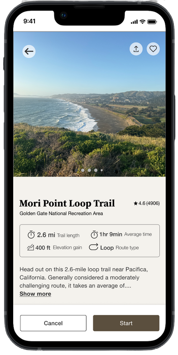
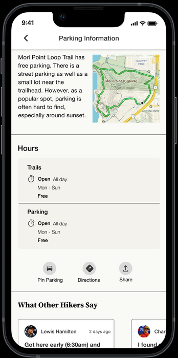
Get key trail info like distance, elevation, and parking
-
Plan ahead to avoid surprises and stay safe
To support his goals, we designed a user flow that delivers all the essentials—fast, clear, and mobile-first—so Jimmy can stay focused on the adventure ahead.
🗺️ How Would Jimmy Use the App?

Jimmy Doesn’t Just Prepare — He Pays It Forward 🫱🏽🫲🏼
Our second goal centered on Jimmy’s desire to support other hikers. When he encounters hazards like fallen trees, trail washouts, or confusing signage, he wants a quick way to share that info with the community.
To support this, we designed a second user flow that lets Jimmy:
-
Report trail hazards in just a few taps
-
Add photos or notes to give helpful context
-
Post updates to a shared community feed that others can check before they hike
This feature makes it easy for experienced hikers like Jimmy to keep others safe, while helping REI build a trusted and engaged user community.
🧭 Helping the Hiking Community
.png)
💡 Brainstorm! 🌪️
From Chaos to Clarity in 20 Minutes
With our app’s functionality mapped out, it was time to bring it to life visually.
We kicked things off with a “Chaotic Design Studio” — a high-energy, 20-minute sketch session where we let ideas fly, inspired by our user flows and Jimmy’s needs. No idea was too weird. No marker was safe.
🖍️ What Came Out of It:
-
Dozens of quick, creative frames
-
A few recurring layout patterns we kept seeing (a good sign!)
-
Sketches that sparked conversation around usability and storytelling
We voted on the strongest concepts, refined the top picks, and began shaping them into consistent, user-friendly components for our Low-Fidelity Prototype.
These early visuals gave us the confidence to move fast, test ideas early, and stay grounded in user needs.
🧪 Our First Prototype
👀 How’d We Do?!
In just two days, we turned our low-fidelity wireframes into a clickable prototype—ready for real users and real feedback.
With two clear tasks in mind, we ran usability tests to see how well our design held up under pressure.
✅ Task 1: Start a Hike
Goal: Begin a hike in under 2 minutes with fewer than 5 errors
Results:
-
⏱️ Average Time: 2:19 → Missed the mark (one user took 4:26)
-
⚠️ Average Errors: 1.75 → Pass
What we learned: One outlier revealed that some of our labels were unclear. Their feedback helped us tighten copy and make critical CTAs more intuitive.
✅ Task 2: Report a Hazard
Goal: Submit a trail hazard report in under 1 minute with fewer than 3 errors
Results:
-
⏱️ Average Time: 0:27.5 → Pass
-
⚠️ Average Errors: 0.5 → Pass
Win! This task was smooth, fast, and error-light — users loved how simple it was to give back to the hiking community.
🚀 Takeaway:
We didn’t hit every target, but we made huge progress — and walked away with actionable feedback to fine-tune our next version.


Let’s make it consistent with REI’s Brand 🎨


🏆 Countless Hours Later: A Product to Be Proud Of
After many late nights and collaborative breakthroughs, I’m incredibly proud of what our team created. While there are still stretch goals we’d love to explore with more time, the product we delivered is:
-
Seamless and efficient
-
User-first in functionality
-
Fully aligned with REI’s brand values
🌟 I’m confident this is a product REI would be proud to call their own—and one I’m proud to have helped bring to life.
💡 Takeaways & Reflections
Working on REI Ready was an incredible opportunity to deepen my skills in user-centered design, cross-functional collaboration, and agile iteration.
-
User-first mindset: I learned how critical it is to ground design decisions in real user needs—whether that means simplifying flows or adding community features.
-
Collaboration is key: Partnering closely with researchers, designers, and stakeholders taught me how to balance diverse perspectives and keep the project moving forward smoothly.
-
Design systems matter: Building and maintaining a style library reinforced the importance of consistency and brand alignment, especially in collaborative environments.
-
Adaptability: Tight deadlines and evolving goals required me to stay flexible and focused, always prioritizing what delivers the most value.
This project reaffirmed my passion for designing meaningful digital products that make outdoor experiences safer and more enjoyable. I’m excited to carry these lessons into my next challenge—and continue growing as a UX designer.
🎉 The Final Product Is Here! 🙌
With testing behind us and insights in hand, it was time to bring our vision to life.
To kick off high-fidelity design, I:
-
Researched REI’s design system to understand their visual language and tone
-
Built a custom style library in Figma, including components, colors, and typography
-
Guided the team on how REI applies its brand consistently across digital platforms
Working side-by-side with our lead designer and incorporating research feedback, I helped ensure every screen was:
-
Consistent with REI’s brand
-
Informed by user insights
-
Built for clarity and usability
🎯 The result: A clean, polished prototype that’s presentation-ready—and fully aligned with REI’s mission to get people outdoors, safely and confidently.
🏆 Countless Hours Later: A Product to Be Proud Of
After many late nights and collaborative breakthroughs, I’m incredibly proud of what our team created. While there are still stretch goals we’d love to explore with more time, the product we delivered is:
-
Seamless and efficient
-
User-first in functionality
-
Fully aligned with REI’s brand values
🌟 I’m confident this is a product REI would be proud to call their own—and one I’m proud to have helped bring to life.
💡 Takeaways & Reflections
Working on REI Ready was an incredible opportunity to deepen my skills in user-centered design, cross-functional collaboration, and agile iteration.
-
User-first mindset: I learned how critical it is to ground design decisions in real user needs—whether that means simplifying flows or adding community features.
-
Collaboration is key: Partnering closely with researchers, designers, and stakeholders taught me how to balance diverse perspectives and keep the project moving forward smoothly.
-
Design systems matter: Building and maintaining a style library reinforced the importance of consistency and brand alignment, especially in collaborative environments.
-
Adaptability: Tight deadlines and evolving goals required me to stay flexible and focused, always prioritizing what delivers the most value.


